After organising all of the titles, I decided to change the names of them. I then made them more packed together, just like a Kerrang magazine would have them. I also added in my editor picture, just like my style model has done. I made the subscription box bigger to fill in more space. I didn't really like the other band name so I changes it to 'Above Apology'. Some of the text seemed to be quite close to the edges of the page so I moved the contents on the right side of the page slightly closer to the left, then I moved the text at the bottom of the page up a little bit. I made the words 'Issue NO' and 'Cover date' at the top bold to follow my style model.
Thursday, 29 January 2015
Contents Progress 5
I completed writing the message from the editor by including things such as an upcoming tour that the readers may be interested in, I signed it with my name, the font is called 'Mathilde' and I have taken it from Dafont.com. I then decided to separate all of the titles down the right hand side into separate layers so they would be easier to organise.
Contents Progress 4
I finished the subscription box by putting in important information such as the website for the magazine and then number. I have began writing a message from the editor directly towards the readers.
Thursday, 22 January 2015
Contents Progress 3
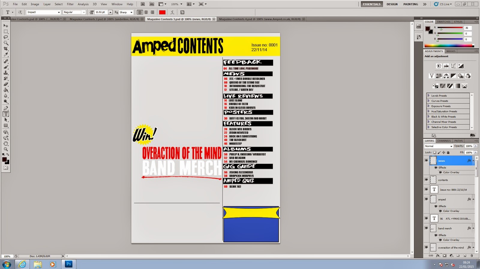
Since the last time, I have finished adding the list of features down the right side of the contents page. I have also started making a subscription advertisement.
Contents Progress 2
I began filling in the list of contents for my page, I used black text for the title and red for the numbers to follow my style model and fit with the house style of the magazine. I also added in a competition in witch readers can take part in to win band merchandise.
Contents Progress 1
I started creating my magazine contents page by making a general layout for it. I added in all of the headings using a black shape tool and placed my text over it, the font I used for the headings on the side is called 'Downward Fall'. I also placed in two really thin rectangles to separate each part of the page.
Tuesday, 20 January 2015
Monday, 19 January 2015
Cover Progress 8
I added more articles which are featured in the magazine to take up more space on the cover, leaving little blank spaces. For two of them I used the black rectangle tool with a white outer glow and used the font, 'Sounds Good' to write about the articles on it. I got the paint splatter from Google Images and put a yellow colour overlay on it. I then put the name of an article on top of it using the font 'Downward Fall'.
Subscribe to:
Comments (Atom)


