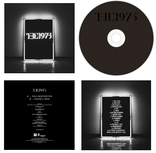
Front
The front cover follows a simple style as it is just a photo of a lit up box with "The 1975" inside of it. This box turned into the band's logo and they have used it on the cover of their newest album but just in colour, this is because it is a recognisable symbol from the band and it is an easy way for the fans to identify them, they also use these boxes at their shows which spreads the awareness and significance of them across their fan base. The cover as well as the rest of the digipak is in black and white because this is how the band represents themselves in person, they mainly wear black clothes and their music videos for this album are all in black and white. It is important to keep the artist's image in mind when making products for them to promote their look and to make sure it is appropriate for their music.
Back
The back of the album is the same as the front cover except inside the box it shows the songs on the album instead of the band's name. Again, this is to advertise this as part of their logo as it is a marketable symbol from the band. The creator of this has included the names of the songs on the back to tell anyone who is looking at the digipak what to expect when listening to the music. In both the front cover and the back, the lighting is in the middle of the photo which draws more attention to the subject of it, in this case, the list of songs. As well as this, the darkness of the edges creates a border and again, focuses people's eyes into the centre more.
Inside
The inside of the digipak is mainly black, the disk is dark with the band's name on it in black and the other part of the inside has a list of credits for the album including the artists and producers, it also has information on the record label. This is a good thing to include in a digipak because it introduces the band and the team behind the album to their audience, especially since this was their first album.
No comments:
Post a Comment