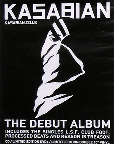
This is a poster for an album by Kasabian, it is completely in black and white which suits the band's look. It is important to keep things like posters similar to the artist's style because they are a form of synergy and are made to promote the band. All of the text is in block capitals which reflects on their sound, the capitals suit rock bands more because they are more rough and angular. The graphic is relatively simple and is the logo for the album, therefore this is significant because people will be able to identify where it is from straight away and it will also promote the album to people who have never listened to it before.
The poster also includes Kasabian's website which is like the home for their band, this is important to include in a poster because people will be able to access their website from looking at their poster, this is where they will sell other music and merchandise so in the end it will result in the band having more sales for their products.
At the bottom of the poster it tells people what the poster is for by having "The Debut Album" and has their most popular singles which feature on the album. They have chosen the most popular songs because there is more chance for people to recognise and like them and therefore go on to but the album.
No comments:
Post a Comment