Tuesday, 15 March 2016

Music Video Analysis 3 - Catfish and the Bottlemen - Soundcheck

In the beginning, the mise en scene of the music video is dark, it shows a ruined room with all of the band members in with low lighting coming from, the roof. This low angle shot introduces the band to the viewers and sets the scene for the rest of the video.
When the music kicks in, the room brightens up and the singer starts to lip sync the first words of the song, here he is shown doing this because his vocals are the most dominant sound and therefore it is most effective to show this through the visuals. The close up shot places emphasis on the singer's mouth.
There are a number of different kinds of shots in the music video, one being this medium shot from the side of the band. It is important to have a range of shot types when making a music video because it gives it more variation and keeps the audience interested by seeing new things.
There are also short clips of close ups of the instruments at times where the guitar is playing a riff for example, they have did this for the more notable parts of the instrumental because they will link together better.
This low angle shot from the back of the band is at the bridge of the song, the room goes dark again with a bright white light facing the band. The use of the dark relates to the lyrics in the video as this is where the lyrics are more sad.
Towards the end of the song the video shows a silhouette of the lead singer lip syncing into a the microphone, this is a very recognisable part because it has been used as the thumbnail for the video on YouTube. It is effective because the high contrast highlights the features on the edge of his face like his mouth for example.


Music Video Analysis 2 - The 1975 - Chocolate


Video: https://youtu.be/CHk5SWVO4p8

Monday, 14 March 2016

Sunday, 13 March 2016

Poster Flat Plans


This is my plan for my poster that I will make for my music video. 

Saturday, 12 March 2016

Music Video Theories - Andrew Goodwin


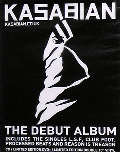
Poster Analysis 1

This is a poster for an album by Kasabian, it is completely in black and white which suits the band's look. It is important to keep things like posters similar to the artist's style because they are a form of synergy and are made to promote the band. All of the text is in block capitals which reflects on their sound, the capitals suit rock bands more because they are more rough and angular. The graphic is relatively simple and is the logo for the album, therefore this is significant because people will be able to identify where it is from straight away and it will also promote the album to people who have never listened to it before.
The poster also includes Kasabian's website which is like the home for their band, this is important to include in a poster because people will be able to access their website from looking at their poster, this is where they will sell other music and merchandise so in the end it will result in the band having more sales for their products.
At the bottom of the poster it tells people what the poster is for by having "The Debut Album" and has their most popular singles which feature on the album. They have chosen the most popular songs because there is more chance for people to recognise and like them and therefore go on to but the album.